
This poster is a good representation of contrast because the text in the middle stands out and contrasts the area around it also there are many shades of green and white which go together quite well.

This poster is a good representation of colour Schemes because the colours don't clash it also has good typography because its clear and easily readable.
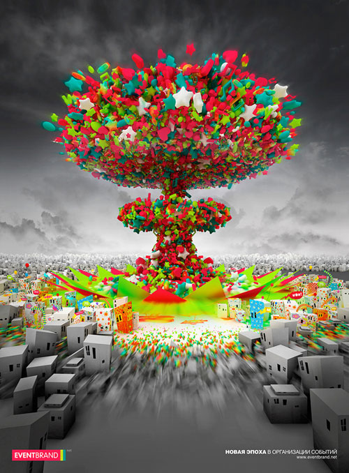
This poster is a good representation of colour schemes and contrast because the middle really brings itself out and draws allot of attention and the colours go very well with the outside and makes the poster look very nice.
No comments:
Post a Comment